The brief
This started with my own commute. I wanted an app that fit my routine and stopped me spending on rides when I was running late.
I spoke to 5 routine bus commuters, mostly friends and people on my route, to define a narrow audience: people who take the same trips every week. BAAS puts their saved trips and live timings first, so a regular trip doesn’t start with planning a route.
Most transit apps open on a map and a search box, which suits a trip you’ve never taken. The commuters I spoke to already knew their bus and their stop. What they wanted to know was when to leave. That’s why I cut route planning from the plan. The hardest constraint was building it alone while keeping live data inside DataMall’s call limits.
Saved trips first, not route planning
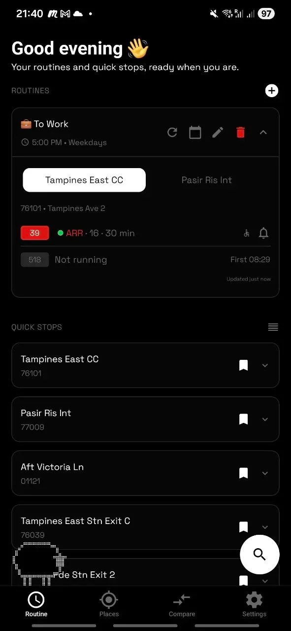
I could have built another journey planner or put the trips people repeat every week up front. I chose saved trips. Each one holds up to three boarding stops and the buses you care about, and opens by itself in the half hour before you usually leave.
Reminders come in two kinds. “Time to leave” reminders are scheduled on the phone as weekly alarms, so they fire with the app closed. “Your bus is 5 minutes away” alerts run on the server: it checks live timings every 30 seconds, follows one specific bus and sends a single push when it’s close.
The cost: a one-off trip still means searching, and there’s no route planning.
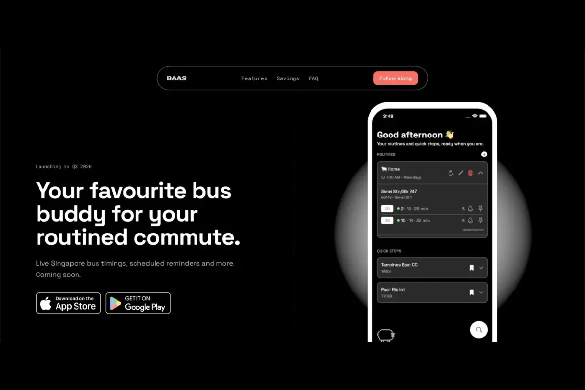
The home screen shows saved trips with live timings, alongside scheduled reminders. The app’s map works as a route visualiser.
Showing what a ride really costs
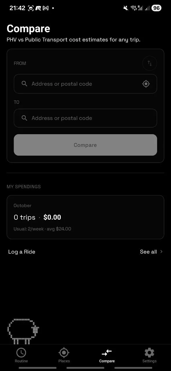
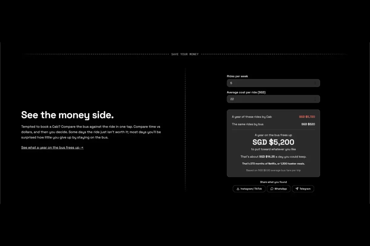
Most bus apps stop at timings. But for a regular commuter, the costly choice is often booking a ride when running late, not picking the wrong bus. So Compare puts the bus and a ride-hailing estimate for the same trip side by side, with the time difference and how much the bus saves. You can log rides you do take and see your monthly ride spend.
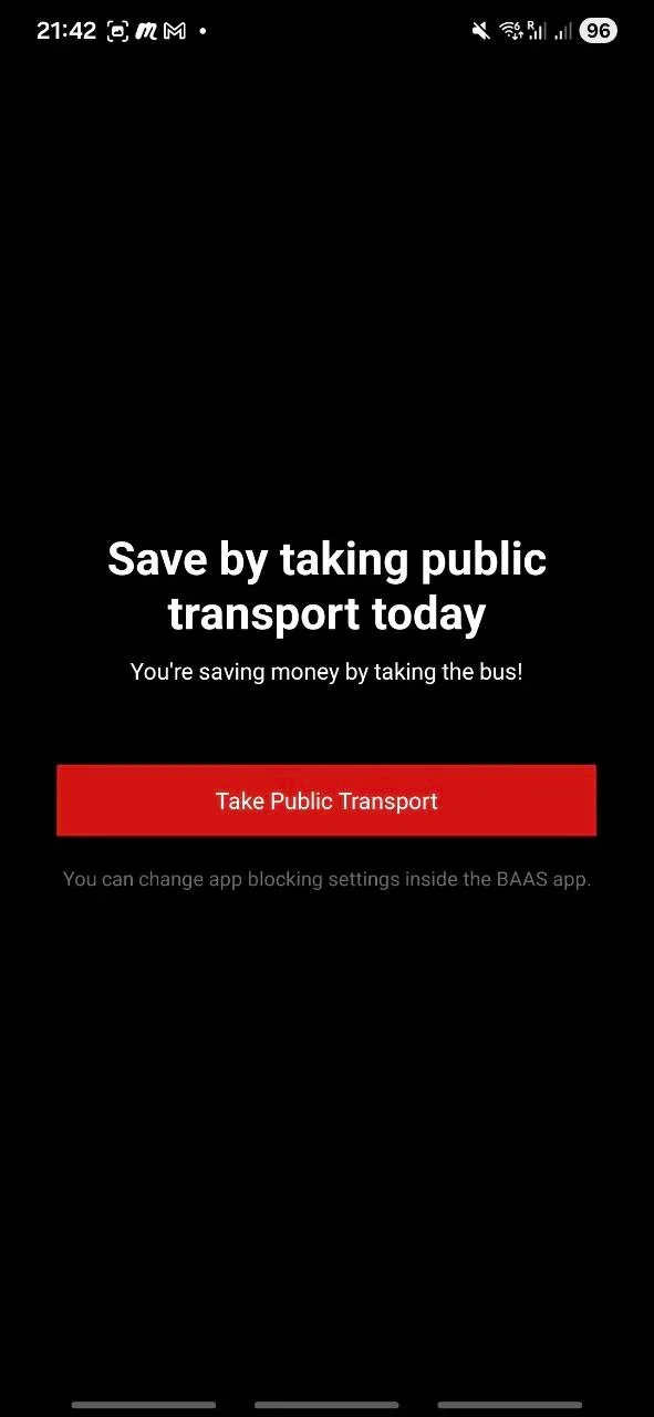
Savings Guard goes one step further. It’s an opt-in pause on ride-hailing apps you pick, during hours you pick. The cost is trust: it needs Screen Time on iOS and Accessibility access on Android. Those are sensitive permissions, so they need careful wording in the app and extra declarations for the stores.
A commuting buddy, not a utility
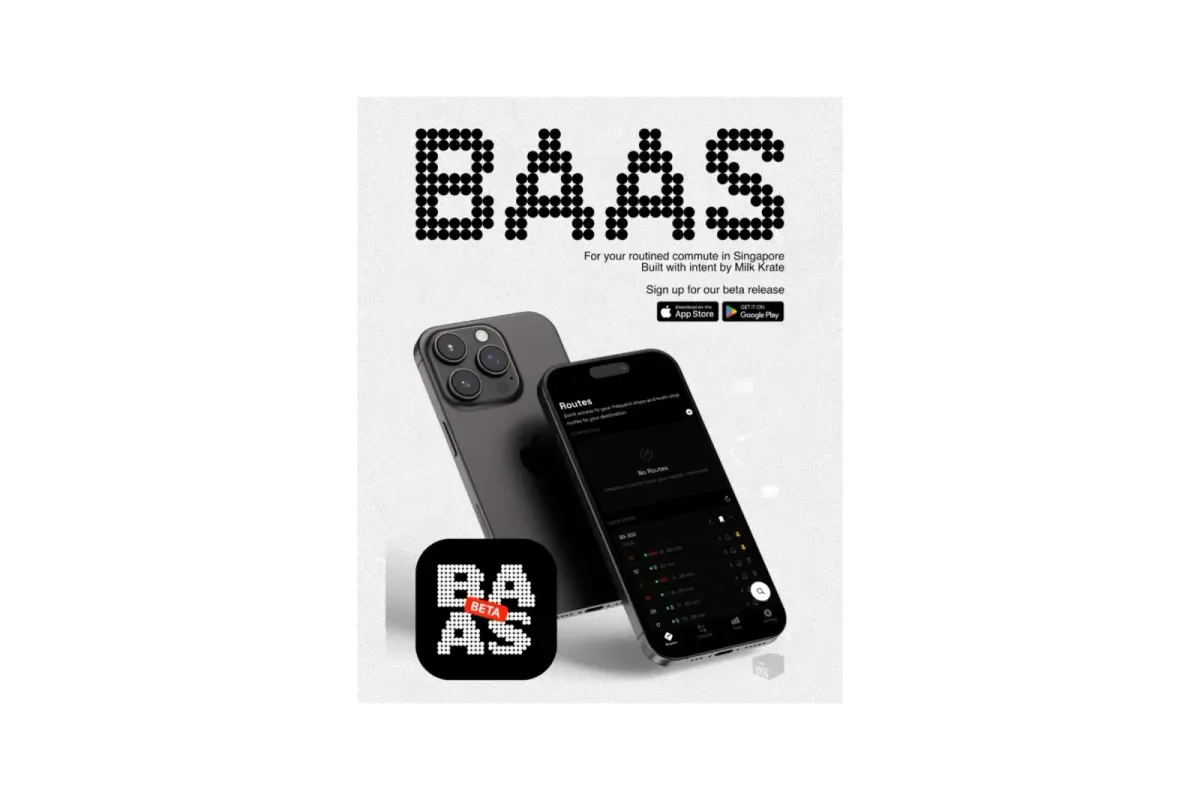
A neutral, grey utility look is the safe choice for transport, and it’s what most bus apps look like. But BAAS is meant to be opened twice a day, every day, and I wanted that to feel like checking in with a friend rather than a timetable. A playful brand also makes a small app easy to remember next to official ones. The cost is time: I drew the brand and the sheep mascot myself, so every illustration came out of build time. A cute brand also has to work harder to look trustworthy, so the live data stays plain and readable.
Caching live timings in three layers
Fetching fresh from DataMall on every request is the simplest option. But I designed it so that at rush hour, when many people check the same stops, it stays inside the API’s daily limit. Each request tries a 30-second in-memory cache first, then a 45-second database cache, and only then DataMall. Busy stops are kept a little longer. When several people ask for the same stop at once, the server makes one call and shares the answer. An entry close to expiry is still served while the server refreshes it in the background.
Timings barely change in half a minute, so the trade is small. The cost is that a timing can be up to 30 seconds old, so pull-to-refresh asks for data under 10 seconds old.
Cutting my favourite feature
Alight alerts buzz your phone one stop before yours, even with the screen locked. They were the feature I was proudest of, and I’d tested them properly: my first check was too lenient and passed everything, so I rebuilt it to replay real bus routes, and early alerts dropped from 753 to none. Preparing for the app stores showed me the cost: it was the only feature that needed background location. That brought extra permissions, store declarations and demo videos, and each one was a reason for review to reject the whole app. I removed it from the first public release and kept it on a separate branch for the next version. Before submitting, I checked the built app itself to confirm it asked for no background location. The beta now ships with no background location at all.
Testing also showed that on some Android phones, departure reminders silently didn’t fire unless an “Alarms & reminders” setting was on. The app now checks for it every time it opens, and shows a banner until it’s on, so a reminder can’t fail silently.
Now every feature starts with its permission cost: what it asks of the user and of store review. Anything that could hold up the whole app ships on its own.
Outcome
About 10 beta testers have the app, with 30 more people on the waitlist. Next comes the public App Store and Google Play release, with alight alerts coming back in the following version.